January 23, 2019
Cluster Correlation Scale
Overview of RedMaPPer Y3 Data
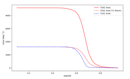
The RedMaPPer Y3 data is divided into two types of catalog: volume-limited and full. The volume-limited catalog is limited in redshift as shown in Figure 1. The full catalog does not apply the same redshift limit. For either type, you can then choose between a catalog which include clusters of richness greater than 5, or richness greater than 20.

I am currently using the Volume Limited catalog with lambda > 5. The full catalog contains ~268,000 clusters from z=0.1 to z=0.946. The part of the catalog overlapping with the ACT y-map region contains ~80,000 clusters.
Motivation for Finding the Correlation Scale
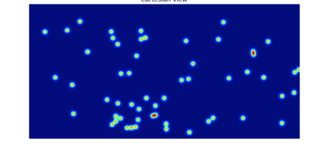
When I plotted all the cluster positions and smoothed them to a four arcminute beam, they were so separated that this did not create the nearly smooth number-density map that we want. Furthermore, if I cut the catalog down into small redshift slices, the clusters are even more sparse. Therefore, I want to know what the optimal scale is to be smoothing on, to create a useful orientation map which will contain relevant information about super-clustering. One way to figure out the best scale is to find the cluster correlation scale: at what distance are clusters most clustered? Another question I have is: what is the ideal distance to slice the cluster sample at? A comoving distance of 30 Mpc? 100? Larger? Examining the cluster correlation function for various slices in redshift will tell us the information on super-clustering scales that we need.
Method and Plots
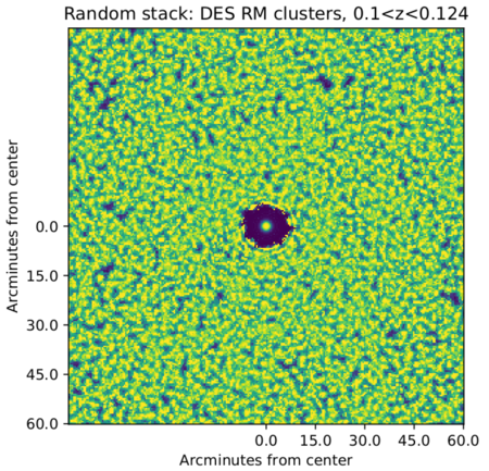
1) Create a map of Redmapper clusters as point sources. I am smoothing the point sources to 2'. I start by using a redshift slice that corresponds to the first comoving 100 Mpc of the sample. This has 2,810 clusters from 0.1 < z < 0.124.
2) Stack each cluster on top of each other with its surrounding field oriented randomly. Figure 2 shows the stack.
3) I move out from the centre of this image in radius bins of 1'. Within each radius bin, I sum up the flux in that annulus and divide by the area of the annulus. This gives the flux per unit area at each radius step, which should be representative of the scales at which clusters typically lie from each other. Figure 3 shows this plot. Because of the sparsity of clusters in this redshift region, the counts drop to 0 before spiking back up again at 8.55' away from the center. This could mean that 2*8.55' FWHM is a good smoothing scale, but what it mostly tells us is that the sample here is too sparse.

Figure 4 shows the map of DES clusters overlapping with the ACT sky coverage region, smoothed to a FWHM of 2*8.55'.
I repeated this process for the 100 Mpc region with the most clusters: 0..65 < z < 0.68. This was much more populated: ~13,000 clusters. (Figures 5 and 6).
Since it looks like there's some kind of bump at around 12-13 arcminutes, I tried smoothing the DES cluster map of this redshift range to a beam of 25': Figure 7.


